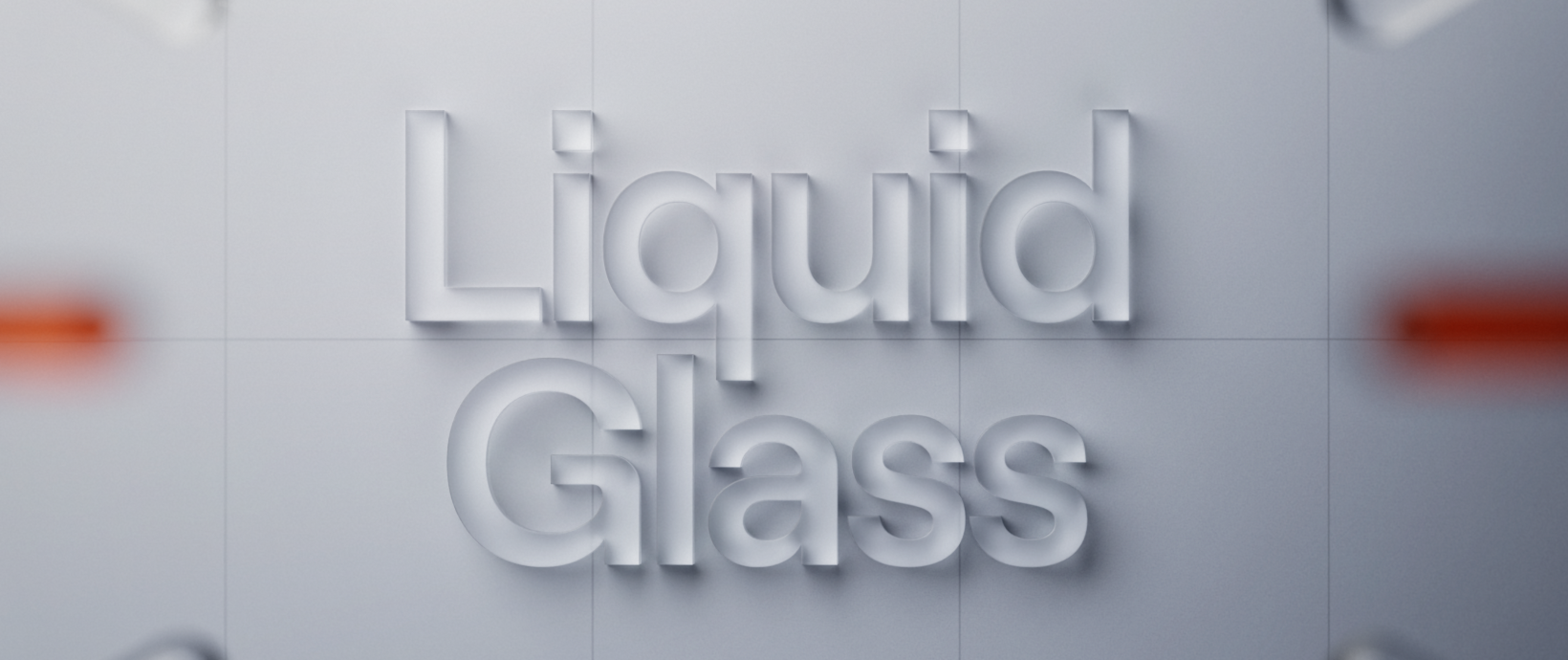
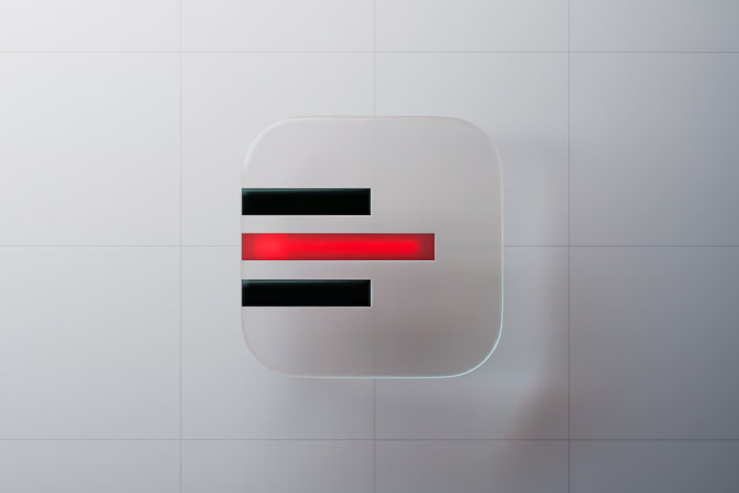
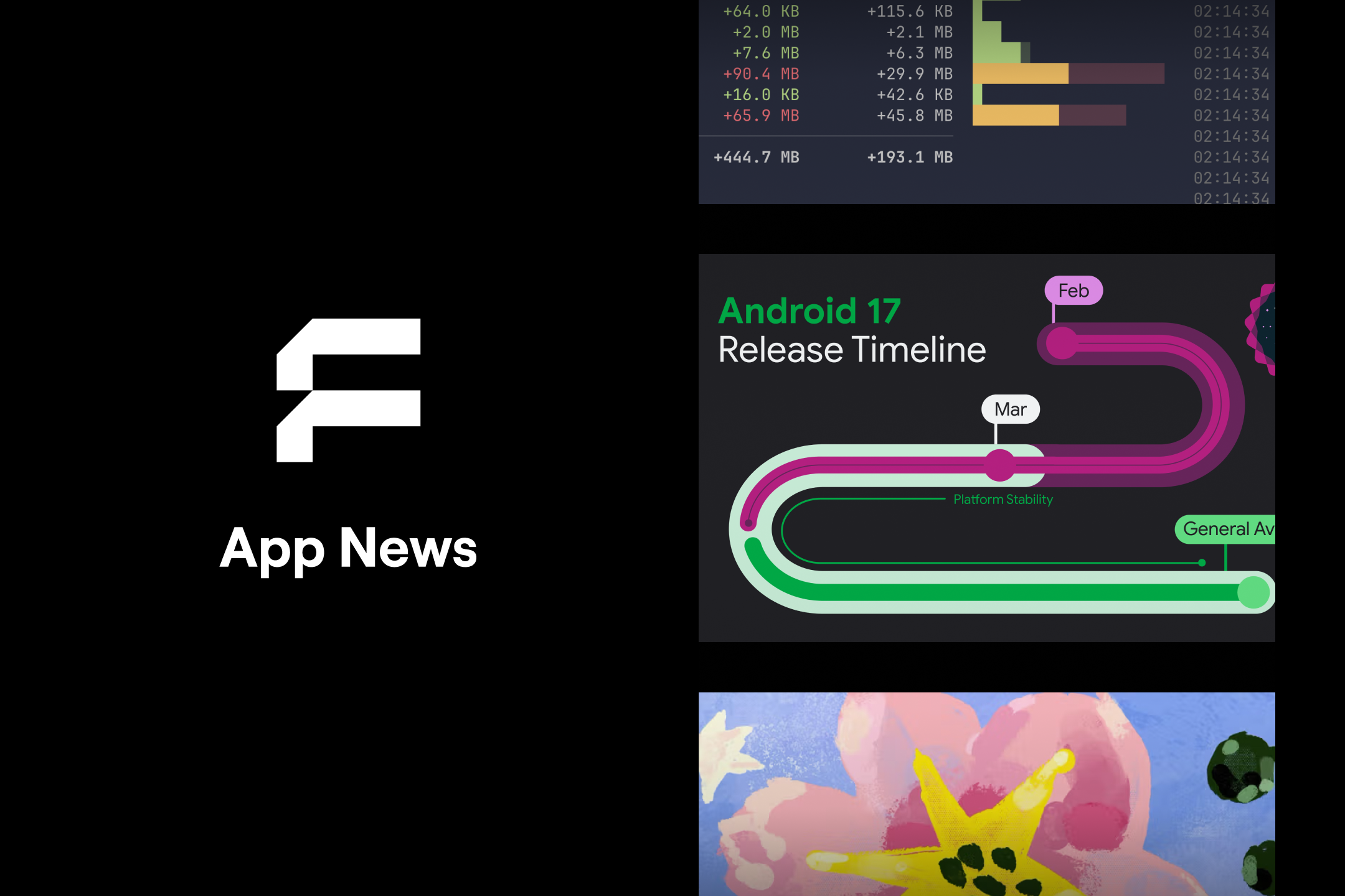
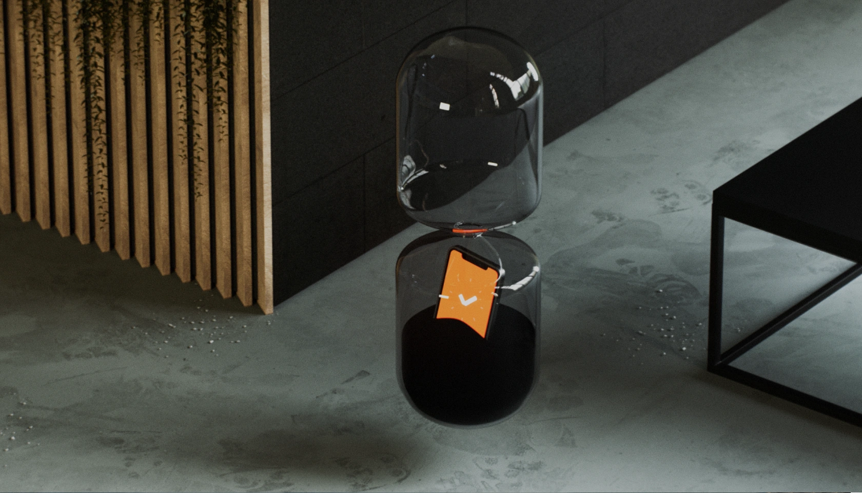
Apple has unveiled a new design language called Liquid Glass, which arrived with iOS 26, iPadOS 26, and macOS Tahoe 26. It’s the most significant visual shift since iOS 7, when skeuomorphic textures and the classic paper-like Notes app were replaced by flat design.
So how will Liquid Glass shape the daily work of developers, designers, testers, and end users? Our team put together a few perspectives - different, yet inseparable.
Developer’s View
Liquid Glass builds on principles Apple first showcased in visionOS - the world of Apple Vision Pro, where content literally “floats” around the user. Apple’s goal was to bring that same feeling to iPhones and Macs.
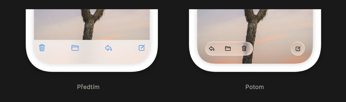
The new design puts content first. Cut-out panels and fixed bars have been replaced by UI elements that feel like they’re hovering above the content itself. This has several consequences:
- The tab bar is no longer anchored to the bottom but adapts to motion and context.
- The navigation bar and search adjust dynamically - appearing and disappearing to stay out of the way.
- Toolbars shift based on context, making apps feel more fluid and alive.
Personalization is also getting a boost. For the first time, Apple allows users to influence the overall look of their system - from accent colors to app icons. Icons are no longer flat images; they now consist of multiple layers that respond to system-wide settings.
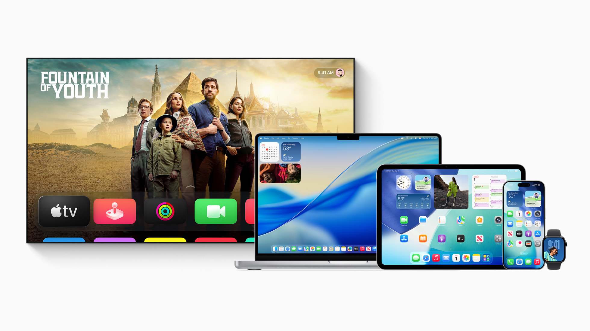
With Liquid Glass, Apple is unifying its visual language across platforms - whether you’re wearing a Vision Pro, working on a Mac, or holding an iPhone, the interaction should feel consistent.
Developers don’t need to support the new design right away. By adding UI Design Requires Compatibility to project settings, apps can keep their old look. But this is only a temporary option—Apple is expected to enforce the transition over time.
Designer’s View
Liquid Glass is the most radical change since iOS 7 - dynamic toolbars, adaptive navigation, and customizable icons redefine how the system feels. But how have users reacted? And why might this update be more strategic for Apple than it first appears?
Early reactions are mixed. Some praise the lightness and sense of space, while others complain about readability and contrast. Transparent, layered panels look impressive on a keynote stage but can become tiring in daily use. Apple seems aware of this - iOS 26.1 beta already introduced tweaks: a redesigned Phone keypad, a new video scrubber in Photos, and more colorful elements in Calendar. There’s also a Reduce Transparency option in settings for those struggling with the look.
Zooming out, this is more than just design. Apple has a long history of controversial moves - removing the headphone jack, introducing the iPhone X notch, or the switch to USB-C. These changes were divisive at first but eventually became the norm. Liquid Glass feels like another training step: getting us used to layering, depth, and transparency - concepts that will play a key role in XR, smart glasses, or in-car HUDs.

QA Engineer’s View
For testers, Liquid Glass introduces new challenges. The first is readability. Transparent panels may look stylish, but depending on wallpapers or backgrounds, they can cause serious usability issues.
Another challenge is personalization. With users now able to adjust themes, colors, and layouts, apps need to be tested across a wider range of visual configurations - light mode, dark mode, custom accents, and more.
Backward compatibility is another concern. Not everyone updates to the latest OS right away. Many users will still run older versions, which means QA must cover multiple iOS generations in parallel. This is the only way to prevent bugs from slipping through on outdated devices.
Finally, there’s the practical side: testing should start as early as beta OS releases. That’s the best way to catch issues with animations or UI components before end users encounter them. Once final SDKs are out, it’s worth running another full pass to confirm everything works as expected.
Android Developer’s View
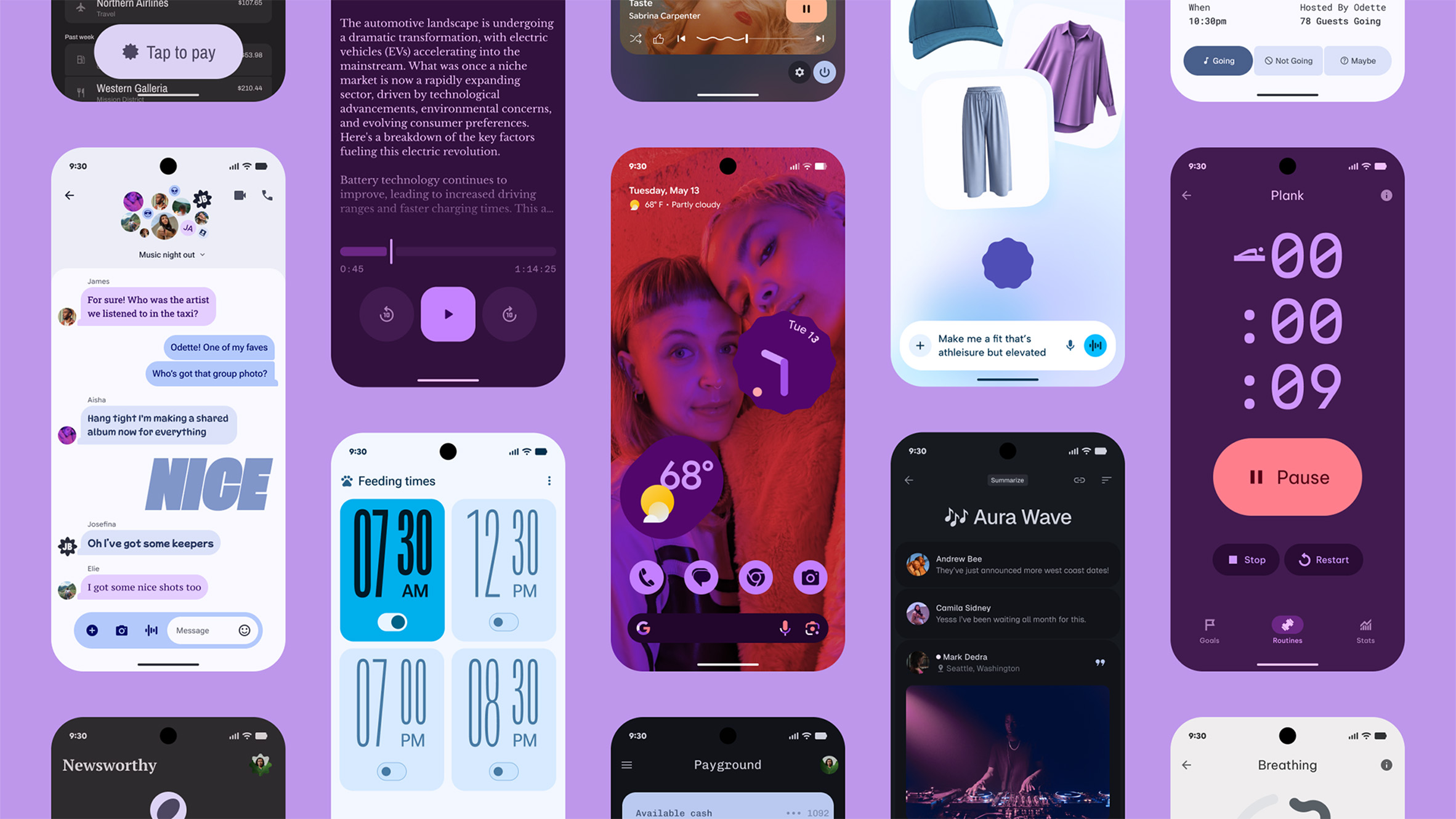
On Android, similar changes are underway. Google has introduced Material 3 Expressive, a design system aimed at breaking away from rigid app structures and adding more dynamism and personality.
The key difference is Google’s emphasis on deep personalization. Users can extend their chosen color theme across the entire system and supported apps. Developers, on the other hand, get more freedom to add character through typography, micro-animations, or custom shapes and rounded corners. Material 3 Expressive brings smoother transitions and more responsive UI elements. Visual components are no longer just structural scaffolding, but emotional enhancers for the content.
Interestingly, both Apple and Google are moving in the same direction: content first, controls as supporting elements. Apple wraps it in Liquid Glass, while Google focuses on color variability and adaptive theming.
For users, it means one thing: whether you’re on iPhone or Android, your apps are about to feel more modern, dynamic, and personalized.
Key Takeaways
Liquid Glass is more than a fresh set of icons. It’s a shift in how Apple thinks about design - from fixed bars and rigid panels toward content as the main focus.
For developers, designers, and testers, it’s a challenge. For users, it’s a refreshing change that makes the system feel more alive.
We discussed Liquid Glass with:
Radek Doležal (iOS), Tereza Lichá (Design), Jan Drásal (QA), and David Kočnar (Android).
--------
Like how we think about apps?Want to chat about your current or future project?Reach out to Lukáš, founder of Futured: Lukáš Strnadel – lukas.strnadel@futured.app – +420 605 312 459


.webp)
%20(2).webp)
.webp)
.webp)
.webp)

.webp)
.webp)
.webp)

.webp)

.webp)
.webp)

.avif)