
Your app is no longer portrait or landscape
With iPhone Duo, the era in which an app was designed for one screen shape and the other was just tweaked to fit is over. We've written up what more space means for app designers, for the product itself, and how it all opens the doors to iPad and macOS.
For twenty years, an iPhone app was designed into a rectangle whose dimensions you knew in advance. Portrait or landscape, or maybe just one of them, because you'd written into Info.plist that you didn't want the other. The system respected that.
As of iOS 27, that's a preference, not a guarantee. An app you build with the new SDK will be resizable whether you asked for it or not. Apple summed it up at this year's WWDC in one easy-to-remember sentence:
"Now, instead of designing for specific devices and orientations, you're designing for a dynamic range of sizes and aspect ratios."
Officially, Apple justified it with iPhone mirroring on the Mac. But after the iPhone Duo reveal, it's clear which way the wind is blowing. The new foldable iPhone goes up for pre-order on October 16 and goes on sale October 23.
Let's take a look together at what this means for your apps.
It's not two phones in one
Before we get to the work and the changes your app will need, let's briefly introduce the new iPhone Duo.
The device has two displays, an outer one for the closed state and an inner one for the unfolded state. Both have essentially the same aspect ratio, so you're not switching between two unrelated modes; instead, as you unfold the phone, the app's space grows smoothly.
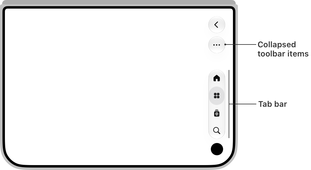
The second thing you'll notice at first glance is that the controls have moved to the side of the display. The tab bar, toolbar, navigation elements, status bar, and Dynamic Island now stack on top of each other along the edge, so that vertical space is left for content and so they stay within reach. We cover this in more detail in the chapter on reachability.
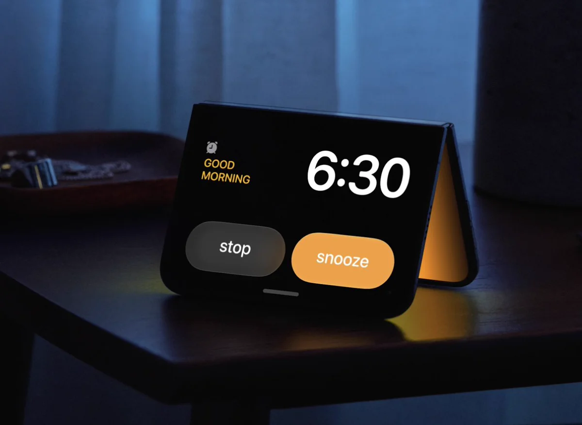
There's also a new concept: the posture. A foldable phone doesn't just distinguish between closed and open. It can be partially folded like a book, laid flat on a table like a laptop, or stood up on its edge like a stand. And the system responds to that.
And one last novelty we weren't used to on previous iPhones: in the unfolded state, the iPhone can do multitasking for the first time. Two apps can run side by side, but it could just as easily be your app running twice.
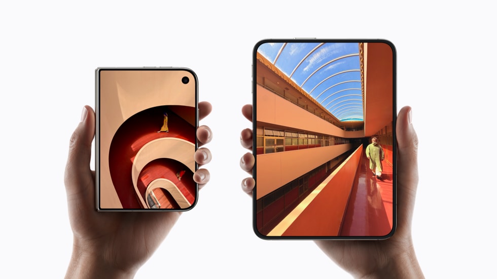
Without any work, you get black bars
That's a lot of changes. But before we dive into how to make the most of the new possibilities, let's talk about how your app will behave if you don't optimize it for the new adaptable layout.
It won't crash and it will be usable. On the outer display it'll run with a black bar along one side; on the inner display it'll sit in the middle with black bars on both sides, in the aspect ratio it's used to from regular iPhones. So the user gets the app in a cutout the size of an old phone, right in the middle of the largest display an iPhone has ever had.
Rebuilding with the iOS 27 SDK fixes part of that. The app will extend up to the status bar, where a narrow black strip remains. But the full screen, including the space beneath the status bar and the vertical layout of the bars, only comes with the iOS 27.1 SDK.
And here it's worth knowing where things stand with that SDK. You can tell that Apple kept the new device under wraps until the last minute even from the developer tools. The iPhone Duo simulator won't arrive until Xcode 27.1, which at the time of writing isn't out yet, and even the iOS 27 SDK, prepared as a release candidate, doesn't contain everything needed for full support of the new device.
But you don't have to wait for the tools. The work that turns your app into one ready for the unfolded display is mainly work on an adaptive layout, and you can do that right now. Let's look at what it involves.
Enlarging or stretching isn't enough
The first thing that comes to mind when you look at an unfolded phone is also the one that takes the least work: just let the existing screen stretch with the window.
That this isn't the right path is hinted at by Apple itself in its guidelines. It mentions scaling only for images, and even there with the condition of not changing the aspect ratio. For the interface it never endorses scaling, and for stretching elements to full width it even has a dedicated rule: avoid full-width buttons. On top of that, stretching costs you legibility, because a paragraph spread across the width of an unfolded phone has a line length the eye can't follow. That's why the system layout guides come with a ready-made definition of readable text width for exactly this case.
More space isn't a license for bigger elements. It's room for more content side by side.
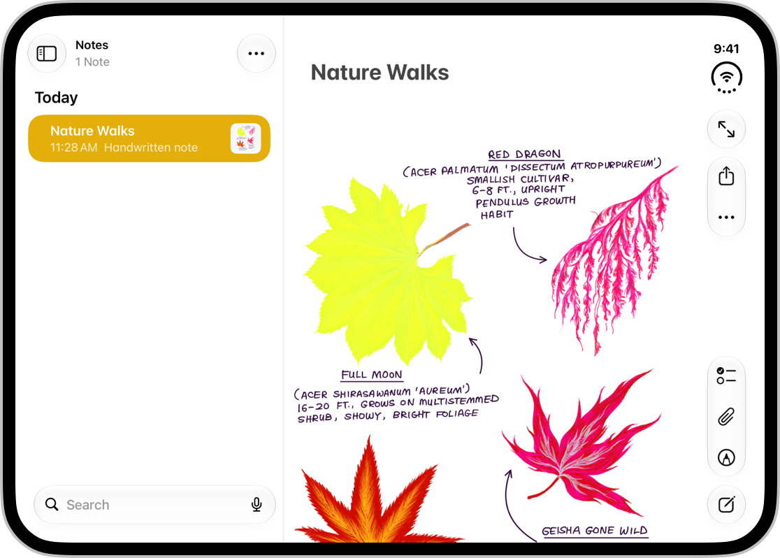
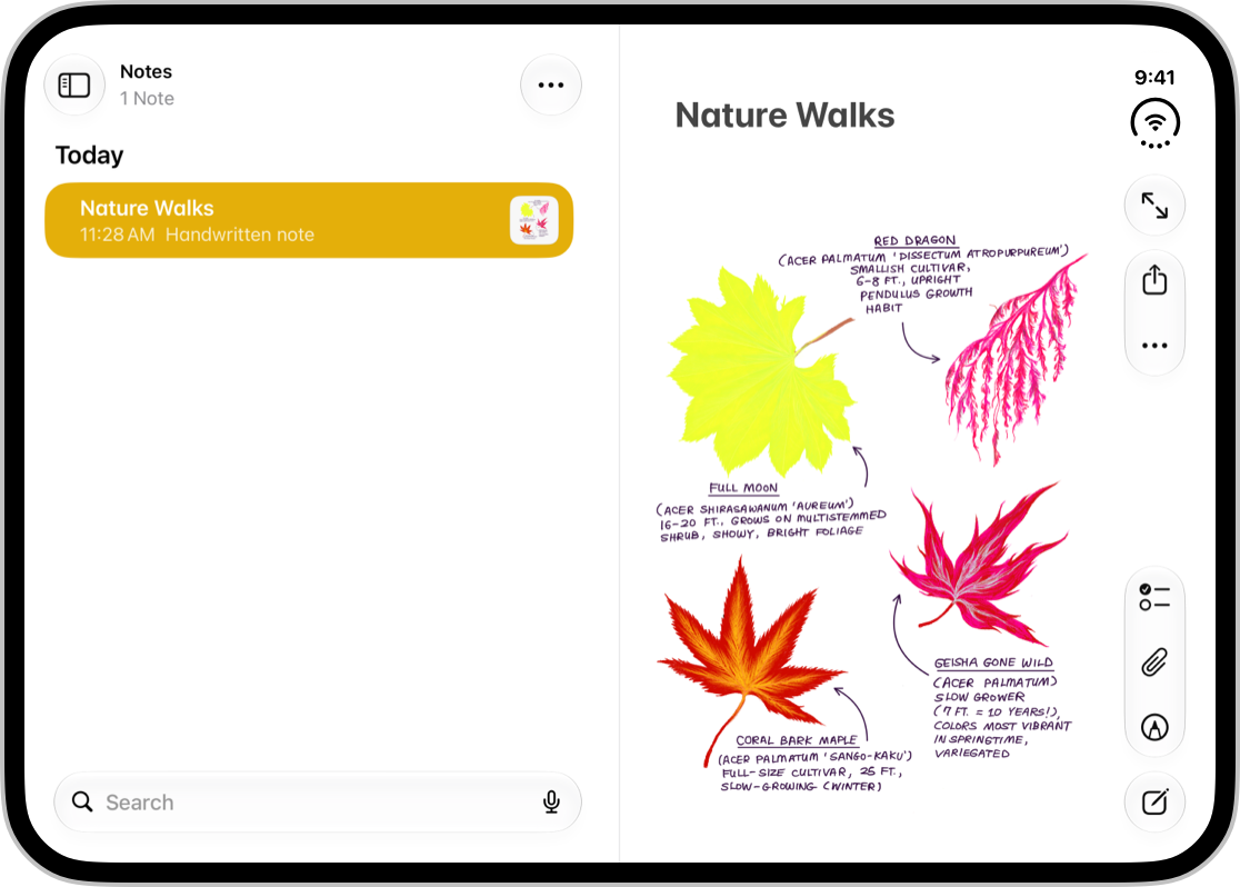
So concretely: respect the safe area and the margins from the edge of the display, and instead of stretching content, work with more columns and with split views. An unfolded phone with a width in the regular size class doesn't mean a five-line-tall title, but it can, for example, mean showing a list and a detail at once.
And those columns can't be static. They should also respond to how the phone is currently folded, because the crease down the middle of the display changes where there's room for content. We'll get to that in the chapter on the new variables.
Start from the widest, not the narrowest
When it comes to the process of designing these complex screens, where the design is closer to an iPad or a Mac, Apple gives a clear recommendation in its guidelines: "As someone resizes a window, defer switching to a compact view for as long as possible. Design for a full-screen view first, and only switch to a compact view when a version of the full layout no longer fits." In other words:
Draw the layout for the inner display first and derive the version for the outer display from it, not the other way around. And switch to it only at the moment the full version no longer fits, not at some predetermined threshold.
This brings a new way of thinking. It's not enough to know what the screen looks like on the inner display and what it looks like on the outer one. You need to know the order in which things are removed from the unfolded layout as the space narrows. That is, one layout and the rules for how it collapses, instead of two independent drawings. And who should decide that order, we'll talk about in a moment.
New variables: reachability and the crease
The new device brings still more variables into design, whose effect may not be obvious at first glance in Figma but will definitely show up once you're holding an unfolded iPhone in your hand:
1 – The first is reachability. An unfolded phone is wide, and your thumb won't reach across the entire surface of the display. That's exactly why the controls moved to the side and stack on top of each other in a vertical bar. Vertical space is thus left for content, and the controls stay within reach of a single thumb.
For layout, this leads to something that's easy to forget. The content area is asymmetric, because the controls sit along one side. The margins and safe areas aren't equal on the left and right edges, and you need to work with each side separately. And when two apps are running side by side on the inner display, each keeps its bars along its own outer edge, so the asymmetry flips for the second one.
Pro tip: for elements that are harder to reach, gestures can help. You can see this pattern nicely in the system swipe-back gesture as a substitute for the hard-to-reach Back button in the top-left corner.
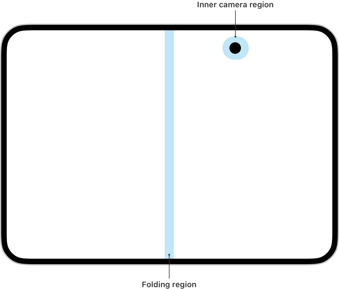
2 – The second variable is the crease at the fold. Apple has its own term for it and its own rules to go with it. So-called reserved regions appear on the display, that is, areas content shouldn't cover and that components adapt to. Two of them concern you. The fold region, which on a partially folded phone splits the inner display into two usable areas, and the region around the camera hidden beneath the inner display, which appears only the moment the camera is turned on. (The third one, the outer camera in the corner, the system handles on its own, because it's aligned with the vertical bar.)
Interactive elements don't belong in these areas. When the phone folds or the camera turns on, content should shift out of them, whether the whole container moves or just aligns around the gap. Scrollable content is the exception; it can happily flow across the crease, because in an article or a feed, reshuffling would be more annoying than the crease itself.
Apple has already done most of that work for you
It sounds like extreme complexity that the new device brings. Here's the reassuring part. For all those adaptations and shifts, Apple has system components, and they do most of the work themselves.
Navigation bars, toolbars, and tab bars know how to work with the safe area and flip themselves into a vertical layout. Alerts, sheets, context menus, and popovers move themselves away from the crease. Split views adjust their column widths and margins on their own based on how the phone is folded. And when there aren't enough controls to fit into the bar, the system tidies them into an overflow menu itself.
So it's one more reason to use system components and to reach for custom ones only where they bring clear added value.
For every custom element you'll pay on iPhone Duo by having to fine-tune all the postures, both orientations, both displays, and multitasking yourself.
And if you're aiming at demanding users, it's also another argument for native technology. Fine-tuning all the states of the new device on a cross-platform framework that doesn't use system components is work that gets expensive before it delivers results.
Navigation: one structure, two forms
This is easiest to see with navigation. The expanded space can tempt you into building two navigation structures, one for the closed state and one for the unfolded state. Here's the second reassuring part: you don't need to.
A split view expands into two columns on the inner display and collapses into one on the outer display. It's the same behavior system split views already have between regular and compact environments on iPad today. On iPhone Duo you get it without having to reinvent it. An app with a tab bar can switch to a sidebar on the inner display. So for many apps, you don't have to choose between a tab bar and a sidebar at all: from a single information architecture you get both.
Two navigation structures mean two sets of decisions that diverge with every new feature. One structure with two forms can't diverge.
Content priority is a product decision, not a design one
Let's move from design recommendations to product ones. And we'll start by answering a question we touched on earlier: who is supposed to decide what shows on the screen and what gets hidden.
On iPhone Duo, that question has two levels.
- The first is content. When the phone closes, the space shrinks by half, and part of what was visible side by side on the inner display has to be hidden or moved one level deeper. The system reshuffles the layout, but it doesn't decide what's essential.
- The second level is the vertical bar. Only a limited number of elements fit into it, and the rest disappear into the overflow menu. Here the app has to decide what it sacrifices first. Sometimes it's the navigation elements, that is, the tab bar, and sometimes, on the contrary, the controls in the toolbar. It depends on the nature of the app. Where the user is mainly browsing content, it makes sense to tuck away the actions and keep the main destinations visible. In an app built around a single task, it's the reverse, and priority goes to the actions that complete that task. And even within the bar you need to define the order, because without intervention the elements are removed from the bottom up, which for most apps isn't right.
And that brings us to the answer. Content priority, that is, what's essential and what can be hidden, has to be decided by you, and it's a product decision more than a design one.
Going through the main screens and, for each one, defining the essential content and the order in which the extras are removed should become a standard part of the product brief.
The system is waiting for that priority, and when it doesn't come, it decides for you.
Accessibility as a side effect
Optimizing the layout has one more benefit that can get lost in all the work on redesigning screens and defining content priorities. A layout that reshuffles when the window grows is the very same layout that reshuffles when the text grows. It's one and the same path through the code.
As a result, you get Dynamic Type support, that is, text enlargement, with no compromises. No cap on font size, no fixed cell height, no truncation with an ellipsis. And enlarged text is not a fringe concern: according to the Appt Foundation, a non-profit focused precisely on accessibility in apps, more than a fifth of users across iOS and Android use their phone with an enlarged font.
So if that flood of potential changes and things to deal with raises the same eyebrow in you as it did in us, you can at least tell yourself that, thanks to the new iPhone Duo, accessibility should improve in apps that until now didn't pay much attention to it.
A bridge to macOS
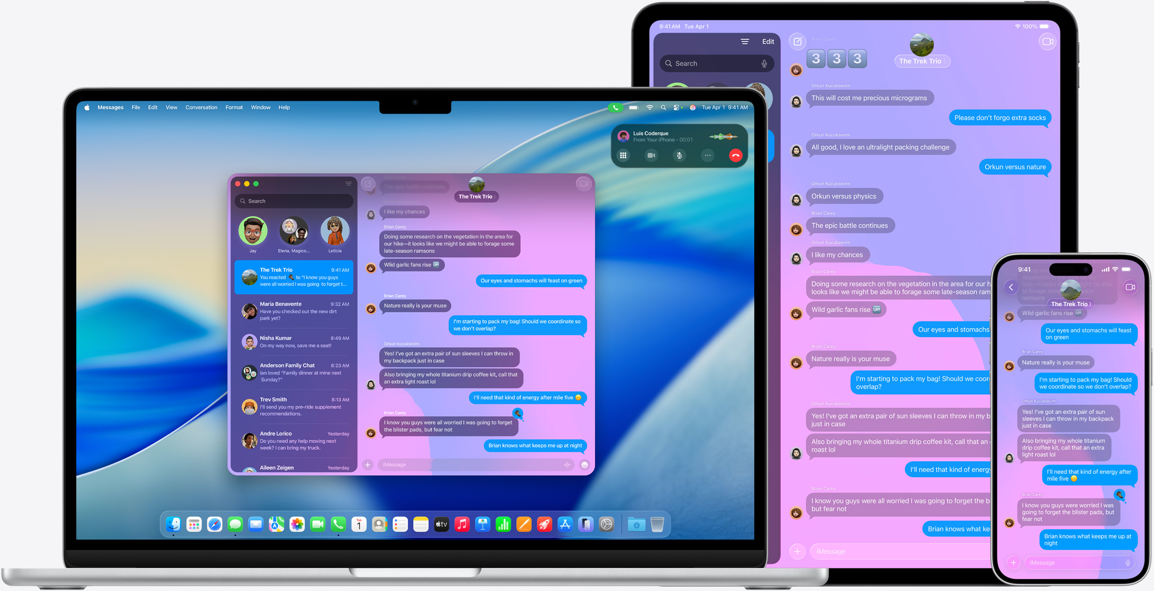
An app that knows how to behave at any window size has most of the journey to iPad and Mac already behind it. And that's the best part of the whole thing: the work you do for the foldable phone brings more than just support for a new device. You're holding a ticket to the entire ecosystem.
So it doesn't come across as flipping a switch: what that work solves is the layout. What it doesn't solve is the Mac behaving like a Mac. You get a menu bar by default, but a usable one is built by hand. Working with the mouse pointer, hover states, and right-click are primary interactions on the Mac, not an add-on. A Mac user expects to open the app in multiple windows, and file access there works on a different model. So an adaptable layout doesn't spit out a finished macOS app. It spits out the foundation on which an MVP of your app's macOS version can be built far faster than from scratch.
And such an MVP can then serve nicely to validate the business potential of a macOS version and whether it's worth the full investment. A decision that would otherwise be made on a guess, you can make over a real product.
And one more administrative thing worth knowing before you run into it yourself: universal purchase lets you offer the iOS, macOS, and other versions of your app as a single purchase, but existing separate app records in the App Store can't be merged. You have to pull all but one from sale and add the platforms to that survivor. Ratings and reviews don't carry over, so it's a one-way decision. If you have your iPhone and iPad app as two records, consider it now, not later when you're speccing the macOS version.
So iPhone Duo isn't just another device in Apple's product line; it opens up possibilities we haven't had to think about until now. It's not for nothing that Apple's new CEO, John Ternus, calls it the biggest change to the iPhone since it came into being.
Bonus: a phone that stands on the table is a new opportunity
Everything above is work to make an app hold up on iPhone Duo. But the new postures are at the same time an opportunity to set your app apart from the crowd. Partially folded like a book, laid down like a laptop, stood up like a frame, each of those positions can do something no other iPhone can.
And if you use one of them in an original way, it stops being optimization and becomes a feature.
For example, a cooking app that, when the phone is stood up on the counter, shows the recipe legibly from two meters away doesn't need a new function, just one extra screen. And an idea like that can bring more attention than most of the tasks in your current backlog.
Written by Radek Doležal, iOS Lead at Futured.













.webp)
%20(2).webp)
.webp)
.webp)
.webp)

.webp)
.webp)
.webp)

.webp)

.webp)
.webp)

.avif)